Preview

Creation Date
Spring 2022
Description
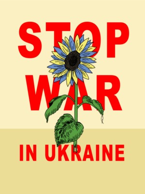
WHY THIS SUBJECT? I chose this subject because I wanted to make a strong statement poster that contrasted the delicacy of a flower against the words "STOP WAR" to create and inspire feelings of hopefulness.
WHAT SHOULD WE KNOW ABOUT THE WORK? That the "ashes" reference in the title is actually referring to the flattened "city skyline" in the background. This poster is supposed to be showing the flower (aka. hope) being the only thing that can survive the devastation of war sometimes.
WHAT WAS YOUR PROCESS? My technique was drawing digitally and pulling in many different reference points to create the final product, including tracing the outline of the flower.
For this poster I wanted to choose a topic that was current, so at the beginning of this class and more specifically this project, the war in Ukraine was top of mind. The posters and media coming out of Ukraine have been heavy and the loss of innocent lives has been high. So, for my poster, I wanted to make a strong and clear statement, but also have a feeling of hope to it. Initially, I was thinking of ways to create this feeling of hope, and one of the first thoughts that came to me was a flower. There was something I really liked about the delicacy of a flower in contrast to the words “STOP WAR” plastered behind it, it is very powerful. Another thing that was very important for me with the flower was its coloring. An inspiration I felt a connection to in this was the AfriCOBRA movement. I loved the art style and colorful imagery that they utilized, and I wanted to incorporate that concept somehow on the poster. With that said, I knew right away that I was going to have the colors of the Ukrainian flag in the poster. So, my final choice being the alternating Ukrainian flag colors in the flower petals was to let the viewers have a subtle nod towards Ukraine, maybe even enough to feel some sort of hope. Moving on though, one interpretation I have of the background is that it is supposed to look like a bare bones version of a city skyline that has been obliterated in the war. So, the unsaturated earth tones are to play as the “ash” that has settled everywhere, with the one flower that survived being the hope of the Ukrainian people. But, a second interpretation can be found when you look at them simply as the colors they are. I knew I wanted to have earth tones in the background because it reminded me of a lot of the earth tone greens and browns that are often in military wear, which was to be a small detail that makes the poster hopefully have a greater impact on the viewer. Another inspiration, which was more so for the lettering of this poster, was the look of “old-timey” posters and advertisements from the 1900’s. I wanted it to look clean and concise, but also have that tinge of artistic merit (coming from the flower drawing) but not so much that it takes away from the message.
Creative Commons License

This work is licensed under a Creative Commons Attribution-NonCommercial-No Derivative Works 4.0 International License.
Keywords
Stop War in Ukraine, flower, flag, war, Ukraine, skyline


